Exbury feedback
Stephen Turner and Mark Drury visited us at Chichester to see and respond to our work resulting from our visits to Exbury. Their comments were both insightful and encouraging.
My first work in the studio following on from our visits was a drawing made with charcoal and black and white acrylic paint
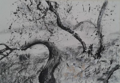
I was interested to find that where Stephen found space in my first large Exbury painting, Mark thought that because the space seems more defined (i.e. landscape) that it did not convey as much space as ‘Another Place’

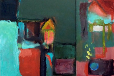
We also discussed how my second large painting was also about Exbury and the experience of being there – without that having been my intention at the time of painting – it just came through.

For me the greeny black area near the bottom came to represent the marsh ‘in-between land’ dividing the woodland and the water. Mark commented how he liked that the blue had breached the green area. He also talked about the topographical feel to some of the marks. For me, the dappling near the top right is an important element, reflecting the shifting light coming through the leaves of the trees. Shirley commented that the two Exbury paintings had a sense of movement that Another Place doesn’t have and that this was a new characteristic to my work.
Stephen’s comment on the second painting was that I am starting to deal with the abstract issues of paint and that the blocks of colour and marks are about painting and not in any way trying to illustrate Exbury.
Artists United Lewes
I went to the private view at the Foundry Gallery, Lewes as four of my paintings were chosen to go into the exhibition.
I thought that the position of them, next to the bar, was good.


Raumzeichnung (Reflection) | Fabrica

Raumzeichnung (Reflection) | Fabrica.
Pictures of Grzymala’s work on the Fabrica website had reminded me of some ‘drawings in space’ that I saw in the Hamburger Bahnhoff Museum in Berlin. This was possibly her work as she lives in Berlin.
I was interested in how the building had been used to create a totally unique piece of work that could not be repeated anywhere else, because the pillars and positions of windows etc were all critical to the work. I like the fact that she had used reflective tape as this emphasised the transition of light across the installation during the course of a day. It was still light when I was in the gallery so I didn’t see how artificial light might have affected the installation.


Exbury Egg Response
I’ve been working in artOne in a fabulous space that is allowing me to do some large scale work on the floor. This is my first large painting on paper – made with acrylics which are drying far too fast because of the heat in artOne, but I am learning how to work with it. I have a water spray which helps and screen printing binder which stops the paint from going dull.
Brian Rutenberg Studio Visit 39 – YouTube
Brian Rutenberg Studio Visit 39 – YouTube.

accessed 27 June 2014
Not for the first time, Brian Rutenberg talks about ‘disappearance’ in painting – he is a landscape painter but he paints until the image of landscape disappears. This is such a helpful comment to me at the moment. I am starting to ‘get’ this and see how it could happen in my paintings – in fact making something appear, without trying is also starting to happen.
Brian also talks about William Edmondson in this episode
Henri Matisse: The Cut-Outs | Tate
Henri Matisse: The Cut-Outs | Tate.
This exhibition is great – very comprehensive and included so much work I had never seen before
Heather Duncan – Morcambelake Art Wave West
Heather Duncan’s paintings are joyful representations of the landscape. I liked her compositions, especial one painting with a dark sky and light ground, called At the top of my World.

She created a clever cruciform with a wide light area going up to the top of the painting and then a narrower dark area going down to meet the bottom edge – very effective.
Her painting called Tamar was the best interpretation of the viaduct that I have seen – so often it is quaint and twee. It is an exciting painting and I like the use of colour – I found there was too much in the painting for my taste, but again I liked the way she had created a kind of a grid – a pattern emerging here.

The promotional material for the exhibition showed another grid based painting: allotment

Ashley Hanson Open Studio at Shire Hall Bodmin
Visited Ashley Hanson who was operating a 3 week Open Studio in Shire Hall, instead of working in his usual space – his garage. His paintings were large and colourful and for me, very appealing. His use of complementary colours was excellent. I also like the way he used aerial vision and then subverted it with upright depictions of tall buildings. The City of Glass series is based on a detective novel written about Manhatten. Ashley lived in New York for a while.

The grids in the paintings are road layouts, the people represent people in the book. It’s a very interesting approach to finding source material for paintings. He showed me a diptych, each painting with a figure carrying a case, and seen from behind. They represented two characters in the book who were seen leaving a train.

Both characters fit the description of a man that the detective was meant to be following. The paintings are about the choice which character should be followed. The arrangement of colours and composition of the paintings lead the viewer to favour one choice rather than the other.
Ashley told me that he always works with two complementaries and one other colour in his paintings. He certainly has excellent sensitivity as to which red he puts with which green. He was achieving the Hans Hofmann effect of push and pull.
Ashley had been exhibited in the National Open at Chichester – not sure which year.