Posted on — Leave a comment

The House that I was born in

There’s something about the house that I was born in that draws me. Happy times I guess. Learning about the world was always enjoyable and I was keen to know learn the next thing. Even then I was drawing out little maps of the roads that I knew – the roads to school, the way to the library and the shops and then later on, my route to the bigger school, which I wasn’t allowed to do on my own. It requiring crossing Brigstock Road with all its buses and vans. It seems amazing now, that I was allowed to walk to school on my own as an infant, crossing two minor roads. We lived in a Victorian semi, which originally had three bedrooms and then the back bedroom was converted to a bathroom and box room.

The House that I was Born in

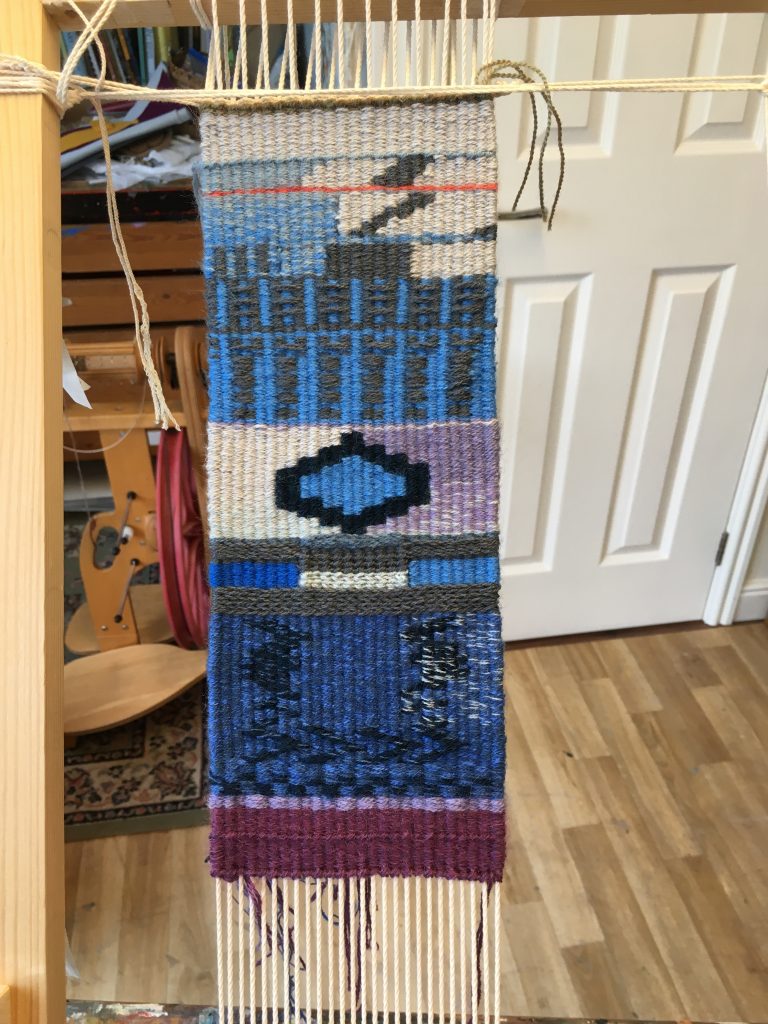
As this tapestry progressed, I was interested in how my use of colours developed. I had an idea of a palette and had decided not to be driven by the aesthetic of the work, which would be my usual approach. Instead, colours took on a meaning and in particular, bright orange for no-go areas like the scullery, that we weren’t allowed into as children. The pale blue areas show where we lived routinely, and places like the front room were very vague to me, only used for visitors and for short periods of time and very cold, with Lino round the edge of the room.

The house I was born in

Another surprising thing for me was the realisation that, in my mind, I always see the plan of this first house with the back of the house at the bottom. Other houses I’ve lived in I see the other way around, the front of the house at the bottom. I guess that I didn’t have to enter this house – I was already in it. It’s where I was born.

The tapestry is small, but quite precious to me and is probably technically my best work so far. I am now starting work on a larger tapestry 33cm wide for my 7-11 house (we moved twice when I was a child). I am going to experiment with using sock wool (cheaper!) but I am wondering if it will be as resilient as the beautiful worsted yarns that I bought from Weaver’s Bazaar and my own dyed worsted yarns.
Posted on — Leave a comment

Tapestry Weaving Continues

Another Sampler

There is so much still for me to learn about tapestry weaving. Despite a lengthy history of working with knitted and embroidered textiles, tapestry weaving imposes its unforgiving linear structure, reminding me of the quotation for the Rubaiat of Omah Khyyam:

“The Moving Finger writes; and, having writ, Moves on: nor all thy Piety nor Wit. Shall lure it back to cancel half a Line, Nor all thy Tears wash out a Word of it.”

….and I have tried to jiggle the weft and tug at the warp to adjust a part of the tapestry that offends my eye. Patching in from behind or beating down harder doesn’t remove those unacceptable wefts which lie further down the tapestry than I am prepared to unpick. And I do unpick a lot. Even in my peaceful studio, devoid of most distractions, I lose concentration, forgetting which direction of travel I need for a new bobbin colour, so as to allow an easy transition or junction with its neighbour.

The most interesting thing for me has been learning how to blend several fine threads together to create a ‘weft bundle’ and how colour graduation is achieved thread by thread with each newly wound bobbin.

Posted on — Leave a comment

Tapestry Weaving

I have recently started the Foundation Diploma in Tapestry Weaving at West Dean College as I wanted to bring together my extensive research into colour, through painting and my many years of working with textiles, mostly through making and using yarn.

I have much to learn and am trying not to be too frustrated with this. Choosing the correct warp thickness and size of weft bundle (I didn’t even know that you could have a weft bundle!) has been quite challenging, but slowly I think I am getting there.

Sampler for borders

I am interested in how artists such as Kirsten Glasbrook use borders in their work and so I tried some ideas out here.

The image below also introduces the use of borders and a central motif with a variegated background to the motif. I was pleased with the colour scheme but I found that the ‘sett’ of the warp was too close for the thickness of the warp. This resulted in a rather congested tapestry that didn’t lie entirely flat. I’m still learning.

Border and bird tapestry
Icon image

This small tapestry is an interpretation of my drawing of a radiator cover in Stansted House. I wanted to try out icon colours, but also to practise graduating the colour of both background and image from dark at the bottom to light at the top.

This is the first of a series of tapestries where the source material is one of my paintings. I am taking fragments of the original (unfinished) painting and interpreting them into tapestry weavings. They are approximately 10cm wide. This first fragment is made on a moderately thick warp (15s) with 2.5 ends to the centimetre. The bottom part is a bit ‘clunky’ but as my hatching improved the imagery improved towards the top. The colours worked for me.

Posted on

Elemental Exhibition with Artel

Getting ready for the Private View

Getting ready for the private view

These photos are the best I can offer, sadly as I was admitted to hospital following on from my back injury in July. I missed my arranged slots to steward the exhibition, when I had planned to take some better shots. I felt proud to be part of this exhibition and we had good footfall throughout. Some more sales would have been welcome, but some members certainly did see some work.

Posted on — Leave a comment

Elemental Exhibition, August 2018 – Artel Group

Elemental Lightbulb

Sixteen artists from the Artel Group will be exhibiting their work in the Oxmarket, Chichester from 14 August to 26 August excluding Mondays. The exhibition is promising to be both interesting and intriguing, each artist having a completely different approach to our subject, Elemental. Several disciplines of art will be displayed and I am looking forward to curating the show as part of a small team from Artel.
My own work will take the form of an installation of paintings and (space permitting) some 2 dimensional paintings on the same subject.

Cookers and Kettles 1

Light Bulb Moment 1

Rigid Element 1

Posted on — Leave a comment

Permanent Studio

Finally, I have a permanent studio space. I have had ‘the spare room’, a shared studio space at Unity Studios in Chichester, a fabulous (but rather expensive) studio in Lavant all to myself and the most grotty space on a smallholding in Almodington. Finally I have a dedicated studio space at home. It is wonderful.

Permanent Studio

Dry studio space

At one end I have my capacious plan chest, which has been with me for nearly thirty years and indeed was my studio for many years. This is the ‘dry studio’, where I do clean work like mount cutting or any of my spinning or textile work.
Studio Storage

Posted on — Leave a comment

‘The Mark’ Paintings

I’m researching a way of painting using a rule of making just one mark within any painting. This is an extension of the repetition work I did in 2015. For the time being I will work on paper, as I intend to make a large number of paintings and storage issues alone will not allow for me to use canvases. I have used watercolour, heavy cartridge and khadi papers. Most papers have been primed, but not all.
This is Mark 4 on primed watercolour paper

Mark 4

and Mark 5 – on unprimed cartridge paper, and was started as a warm-up exercise
Mark 5

Posted on — Leave a comment

Colour, tone and division: thinking visually about painting with Matthew Collings

West Dean Studio 1

I’ve had an excellent week at West Dean College on Matthew Collings’ course ‘Colour, tone and division: thinking visually about painting’
I felt quite challenged to be working with the figure, which is not my usual territory. Making the exercises 3 minute or 6 minute drawings was helpful because you have to grab the essence of the person visually and find a fast way of expressing it.
3 minute drawing Judy

3 minute drawing Judy

3 minute drawing Judy

Restraint was very much the mood of the week, with only line being allowed for some drawings and then only a rubber on pre-charcoaled paper, for example. When it came to paintings, we were only allowed 3 colours and white. I chose yellow ochre for one of my first colours as I find the colour difficult to work with. It seemed like a good opportunity to try it out again, with the knowledge that help was around.
This was my final painting, expressing how alone the artist actually is in front of their work amidst the mess that surrounds the making process.